Back
Back
The Good Dog — Packaging Design
A full brand system for a premium dog treat company — from packaging design to campaign strategy. Every decision made with one goal: make the brand impossible to ignore and impossible to misread.
Role
Graphic designer
Industry
Pets
status
Concept
Year
2026

Challenge
The pet treat market defaults to two modes: clinical or cute. The Good Dog needed neither. The challenge was building a premium CPG brand that felt warm, credible, and shelf-ready without falling into either trap.


Process
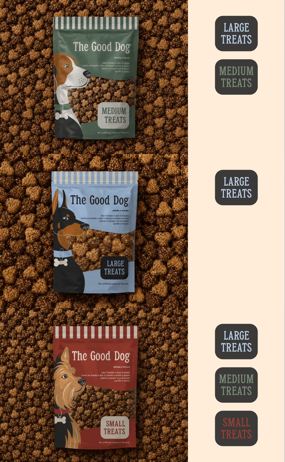
Started with positioning — finding the white space between over-designed wellness brands and generic pet store aesthetics. A character-driven system emerged: three breeds, three colorways, one typographic voice. Color differentiates the SKU range; the illustrated dogs and striped header pattern hold it together. Once packaging was locked, the identity scaled outward into email, social, lifestyle photography direction, and OOH — all pulled from the same visual language.


Outcome
Started with positioning — finding the white space between over-designed wellness brands and generic pet store aesthetics. A character-driven system emerged: three breeds, three colorways, one typographic voice. Color differentiates the SKU range; the illustrated dogs and striped header pattern hold it together. Once packaging was locked, the identity scaled outward into email, social, lifestyle photography direction, and OOH — all pulled from the same visual language.


By The Numbers
3 SKUs unified under one design system
4 email campaigns concepted and designed
9 social media posts developed
1 campaign platform. Zero filler.
74% of pet owners say packaging influences their purchasing decision at the shelf. The Good Dog was designed to win that moment.

Back
The Good Dog — Packaging Design
A full brand system for a premium dog treat company — from packaging design to campaign strategy. Every decision made with one goal: make the brand impossible to ignore and impossible to misread.
Role
Graphic designer
Industry
Pets
status
Concept
Year
2026
Challenge
The pet treat market defaults to two modes: clinical or cute. The Good Dog needed neither. The challenge was building a premium CPG brand that felt warm, credible, and shelf-ready without falling into either trap.
Process
Started with positioning — finding the white space between over-designed wellness brands and generic pet store aesthetics. A character-driven system emerged: three breeds, three colorways, one typographic voice. Color differentiates the SKU range; the illustrated dogs and striped header pattern hold it together. Once packaging was locked, the identity scaled outward into email, social, lifestyle photography direction, and OOH — all pulled from the same visual language.
Outcome
Started with positioning — finding the white space between over-designed wellness brands and generic pet store aesthetics. A character-driven system emerged: three breeds, three colorways, one typographic voice. Color differentiates the SKU range; the illustrated dogs and striped header pattern hold it together. Once packaging was locked, the identity scaled outward into email, social, lifestyle photography direction, and OOH — all pulled from the same visual language.
By The Numbers
3 SKUs unified under one design system
4 email campaigns concepted and designed
9 social media posts developed
1 campaign platform. Zero filler.
74% of pet owners say packaging influences their purchasing decision at the shelf. The Good Dog was designed to win that moment.